


This spring I had the fantastic opportunity to interview Steffi Neukirchen. Steffi currently works at the IU International University of Applied Sciences in Germany as a Professor of Media Design and Program Lead for Communication Design. She lived in Vietnam from 2015-2018, and during that time worked as a lecturer at the School of Communication & Design at RMIT University Vietnam in Ho Chi Minh City, Vietnam.
I asked Steffi about her work documenting vernacular signage in Ho Chi Minh City and around Vietnam through her Signs of Saigon project. This interview has been lightly edited for clarity.
Elisabeth: What is one of the first things a newcomer would notice about the streets of Vietnam? Is there anything that makes them unique or distinctive?
Steffi: When I first arrived in Vietnam, I had previously traveled through Australia, where I had spent more than two months encountering very few people but a great deal of nature. Ho Chi Minh City presented a strong contrast, and I was overwhelmed by the abundance of visual stimuli in the urban environment.
I was overwhelmed by the abundance of visual stimuli in the urban environment.
This is what many newcomers might notice about the streets of Vietnam, and especially of Ho Chi Minh City, formerly Saigon: traffic feels chaotic, consists predominantly of two-wheeled vehicles, and follows its own rules. Large numbers of people are constantly on the move; the sidewalks are lively and occupied by people trading, cooking, building, sleeping, and moving through the space. During my own attempts to navigate this environment, I found myself simultaneously trying to take in my surroundings and process the visual stimuli while also making sure not to burn myself on a BBQ, fall into a hole, or get run over.
What also stood out to me were the shop signs and the signs used by street vendors, all of which were visible from every direction, whether one was passing by on foot or by vehicle. In my view, this phenomenon follows the logic of (motorized) two-wheeled traffic. Because I did not yet understand Vietnamese at the beginning of my stay, I was able to focus more closely on the visual appearance and impact of these signs.
How did you become interested in vernacular typography in Vietnam?
During an outing, a sign attached to a lamppost caught my attention. Someone had hand-written a substantial amount of information on it using two different colors and relatively balanced proportions. Through the explanation of passersby, I came to understand that the same sign advertised both apartments for rent and land for sale. Following this unusual discovery, my perception became particularly attuned to handwritten signage.
When you see hand-lettered or hand-crafted type, what does it mean, or signify, to you?

Nhà Thuê | Rental House
At this point, I would like to distinguish between two types of hand-made or hand-lettered typography in the streetscape of Ho Chi Minh City. On the one hand, there are the signs of street vendors offering services such as motorcycle repairs or goods such as fruit, beverages, or ice cream. These signs often appear unconventional and improvised, partly due to the materials used—such as Styrofoam, because they have been repeatedly overwritten or because of the use of stencils. It seems likely that they are produced under conditions of limited resources, particularly time and money. Nevertheless, the lettering often appears highly intentional, showing evident calligraphic skill as well as a strong attention to detail.
In contrast, there are professionally designed shop signs in the street or in market environments, which were painted by sign painters. These typically use higher-quality materials, demonstrate greater typographic skill, and are more strongly oriented toward durability. Some of these signs are several decades old and therefore carry everyday stories as well as historical contexts. From them, various aspects of visual identity and cultural practice can be derived.
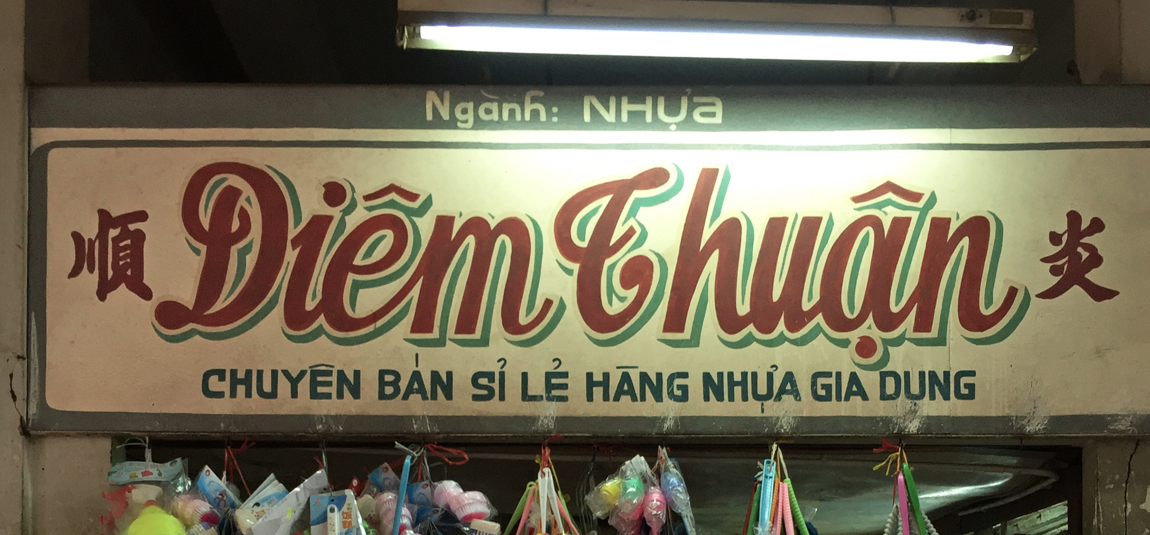
Diêm Thuận | Rental House
What both forms of hand-lettered typography share is their “human touch,” their emotional core or heartbeat.
“The dash of the brushstroke proves my existence in life.” This quote by the sign painter Trần Khôi, whom I had the chance to speak with in late 2017, deeply moved me.
In the “dash of the brushstroke,” one can sometimes see the painter’s heartbeat; in any case, it can be sensed or felt. This creates a deeper human connection to the communicated content, to the message, than would be the case with a mass-produced plastic sign.
What kind of discoveries did you make during your time documenting vernacular typography in Saigon?
Through my dedicated search and fieldwork, I met a considerable number of people who were willing to share their knowledge and contribute their ideas. This occurred partly through academic networks, lectures, and interviews, but also via my social media profile on Instagram. There, for instance, through a targeted call for assistance (“crowd help needed”) and with the support of a British journalist, I was able to locate one of the sign painters whom I later interviewed.
This process significantly deepened my understanding of Vietnam’s visual identity and broader cultural practices. At the same time, I encountered numerous traces of foreign influence, ranging from French colonial heritage to American cultural presence in South Vietnam during the Vietnam War.
I also observed that cultural practices can develop in parallel across different parts of the world, often in similar ways and at similar times. Style often travels much like people or ideas. In the 20th century, however, this process unfolded at a considerably slower pace than today’s era which is shaped by platforms such as Pinterest and other digital media.
Why do you think it is important to do this type of documentation work?
In particular, Vietnamese professional shop signs represent a form of living history—or perhaps a living fragment of history—from which much can be learned. These signs are gradually disappearing, as they are inherently fragile, unable to withstand processes of modernization, exposed to natural weathering, or ultimately lost to large-scale renovation projects, as has already occurred in the case of the large Chợ Bình Tây market in Chợ Lớn, Ho Chi Minh City, Vietnam.
Vietnamese professional shop signs represent a form of living history… from which much can be learned.
From my European perspective, there is a strong inclination to preserve and protect originals—or at the very least to document them—so that future generations may learn from them.
Since The Vernacular Type Project constitutes an international collection, it will, over time, make it possible to examine vernacular typography in a global context, to compare it across regions, and potentially to identify transnational connections without the necessity of travel. Knowledge will be concentrated and made available to an interested community—who will then be able to exchange ideas about it.
Steffi is a contributing editor with The Vernacular Type Project. You can view her contributed signs on her profile page. Below, she shares a bit more detail about who was involved in the research project she completed while living in Vietnam.
I applied for a research grant together with Simon Richards in 2016, who was also a lecturer at RMIT at that time. Our research topic focused on “Identifying and documenting classic Vietnamese typographic design evident in rapidly changing urban environments,” with him concentrating on Hanoi and my own work focusing on Ho Chi Minh City.
My student and research assistant, Nguyễn Chí Tín, supported me in documenting all hand-lettered signs in and around Chợ Xóm Chiếu, obtaining a photo permission for the market and he conducted conversations with several shop owners.
A second student and research assistant, Phạm Đăng Khiêm, also contributed to the project. Together with him and Tín, we conducted interviews with three sign painters. Khiêm transcribed and translated the interviews and further content.
Lê Quốc Huy, from the project “Lưu Chữ – The Lost Type Vietnam,” introduced me to several significant signs across the city and was consistently available whenever I had more in-depth questions. I invited him to speak to my typography students and present his project. In addition, we conducted an interview in 2020, which was translated by another student.